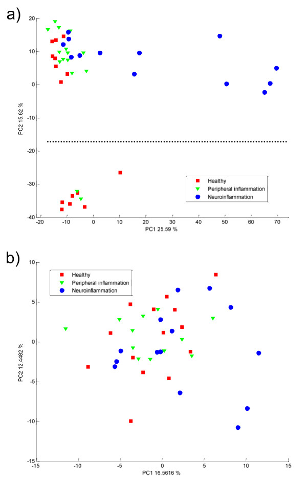
Figure 2.
PCA score plot obtained on a) proteomics data and b) metabolomics data after autoscaling. The healthy and inflammation controls are represented as red squares and green triangles. The disease samples are in blue circles. The dotted line in a) represent the separation between the two batches of measurements.

