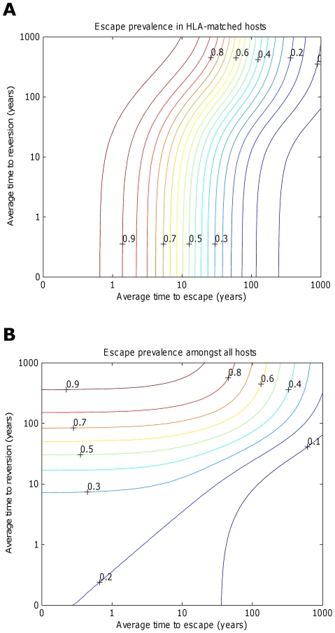
Figure 5. Contour plots showing how the prevalence of escape amongst A) HLA matched hosts and B) all hosts varies according to the escape and reversion rate.
These contour plots explore how the prevalence of escape 200 years into an epidemic varies according to the rate of escape in HLA matched hosts and the rate of reversion in HLA mismatched hosts. Vaccination is applied to all hosts in the population 50 years into an epidemic. Escape is assumed to occur at the same rate at each epitope. Reversion is assumed to occur at the same rate at each epitope and revert at the same rate. At each epitope, escape rates in vaccinated and unvaccinated HLA-matched hosts are assumed to be equal ( for i = 1∶5). The escape and reversion rates are presented in terms their reciprocal – the average time to escape (x-axis) and average time to reversion (y-axis). The contours show that the prevalence of escape amongst A) HLA-matched hosts and B) all hosts increases as the rate of escape increases and the rate of reversion decreases; however, the increase in escape prevalence in HLA-matched hosts with reversion rate is limited when revision takes an average of 10 years or less. The assumptions and parameters used in these figures are the same as those described for Figure 2 except that the infectiousness and life expectancy of successfully vaccinated hosts are fixed at
  and
and  , respectively (
 ).
).

