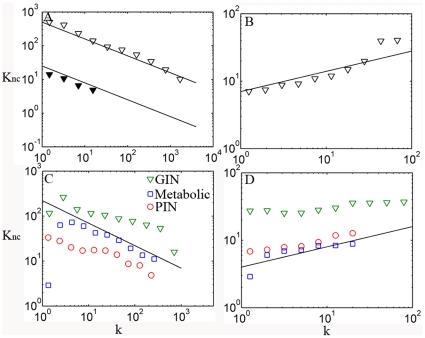
Figure 3. Correlations between node connectivity and its neighborhood connectivity.
A. The nearest neighbors' average connectivity Knc, of nodes with connectivity k for Internet at AS level, and for the rest of network with top 1% best connected nodes removed (solid triangle). B. The same as A but for social network of co-authored relationship. C. Correlations of biological networks: PIN of HC dataset (red), GIN (green) and yeast metabolic network (blue). D. Correlations of biological networks after removing top ∼1% best connected nodes (detailed numbers of hubs removed are shown in Table 1). The solid lines in A and C correspond to  ; the solid lines in B and D correspond to
  . Note that the solid lines in C and D are not fitted to biological networks; they are drawn to compare with Internet and social network.

