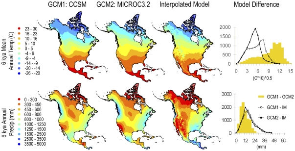
Figure 3. Mean annual temperature and annual precipitation modeled for 6 kya.
Two general circulation models (GCM1 and 2) and our interpolation model (IM) are compared. Graphs at the right show histograms of the absolute differences between the two GCMs (yellow bars) and between our model and each of the GCMs (lines).

