Figure 2.

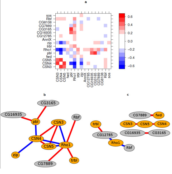
Interaction matrix and graph. (a) Heatmap matrix representation of interaction estimates. The colours represent effect size on the log2 scale. The eight genes from the cell cycle set, CSN3, CSN4, CSN5, fwd, pbl, Rho1, trbl and zip are shown in the lower and left halves of the matrix. The other eight genes had been selected randomly from the fruit fly genome. (b) Threshold graph representation of the interaction matrix. The edges show all interactions with false discovery rate adjusted [42]p-value < 0.1 from the t-test and absolute effect size > 0.3. Orange nodes indicate the cell-cycle set, grey nodes the randomly selected set. The colour of an edge represents the sign: positive interactions are red and negative blue. (c) Correlation graph based on the Spearman correlation coefficient. Correlations with absolute correlation coefficient > 0.8 are shown as edges. The colour of an edge represents the sign: positive correlations are red and negative blue.
