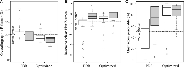
Fig. 2.
Box-and-whiskers plots for structure model quality metrics calculated for the original PDB entries and after PDB-REDO. The open boxes show the ‘legacy’ PDB files, the filled boxes the ‘recent’ dataset. The whiskers cover all data points within 1.5 times the inter-quartile range and the circles denote outliers. The dotted lines mark the PDB averages. (A) R-factor. (B) Ramachandran plot Z-score from WHAT_CHECK. (C) All-atom Clashscore from MolProbity as percentile relative to PDB entries of similar resolution.

