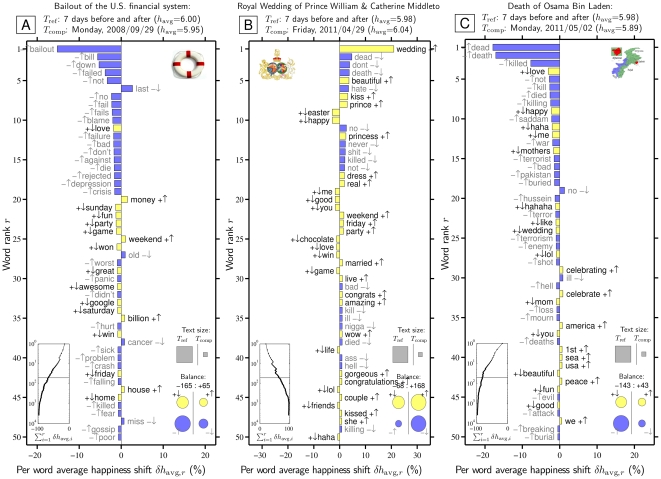
Figure 4. Word shift graph showing how changes in word frequencies produce spikes or dips in happiness for three example dates, relative to the 7 days before and 7 days after each date.
Words are ranked by their percentage contribution to the change in average happiness,  . The background 14 days are set as the reference text (
 ) and the individual dates as the comparison text (
 ). How individual words contribute to the shift is indicated by a pairing of two symbols:
  shows the word is more/less happy than
  as a whole, and
  shows that the word is more/less relatively prevalent in
  than in
  . Black and gray font additionally encode the
  and
and  distinction respectively. The left inset panel shows how the ranked 3,686 labMT 1.0 words (Data Set S1) combine in sum (word rank
  is shown on a log scale). The four circles in the bottom right show the total contribution of the four kinds of words (
 ,
, 
 ,
, 
 ,
, 
 ). Relative text size is indicated by the areas of the gray squares. See Eqs. 2 and 3 and Sec. 4.2 for complete details.

