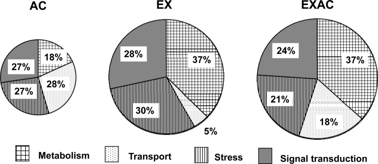
Fig. 4.
Distribution (%) of genes with significant changes in their expression levels (≤/≥ 1.5-fold) by their association with specific treatment, according to functional categories. Pie chart area corresponds to the number of the significantly upregulated/downregulated genes in each group. The majority of the genes were upregulated. Enriched functional categories were sorted using Onto-Tools Suite Software provided by Intelligent Systems and Bioinformatics Laboratory.

