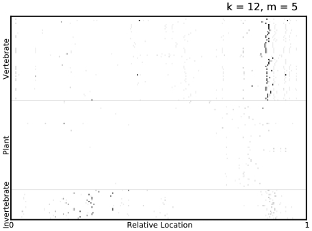
Figure 5. Visualizing predictive regions of protein sequences.
A visualization of the mismatch neighborhood of the first 7  -mers, selected in all ADTs over 10-fold cross validation, for Picornaviridae, where
  . Regions containing elements of the mismatch neighborhood of each selected
  -mer are indicated on the virus proteome, with the grayscale intensity on the plot being inversely proportional to the number of cross-validation folds in which some
  -mer in that region was selected by Adaboost. Thus, darker spots indicate that some
  -mer in that part of the proteome was robustly selected by Adaboost. Furthermore, a vertical cluster of dark spots indicate that region, selected by Adaboost to be predictive, is also strongly conserved among viruses sharing a common host type.

