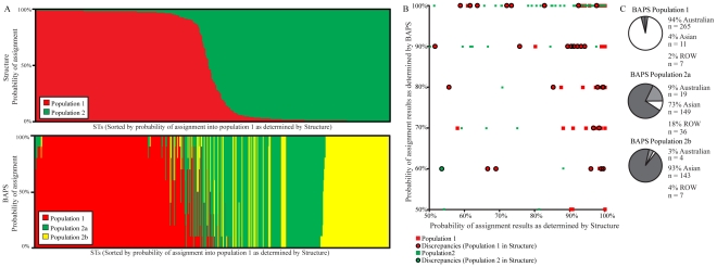
Figure 2. Estimated population assignments and comparisons using BAPS and Structure simulations.
(A) Likelihood of ST assignment into two populations by Structure (top) and three populations by BAPS (bottom). The order of STs in both plots are the same and sorted by probability of assignment into Population 1 by Structure. Each thin vertical line represents one ST and is divided into two and three portions (for Structure and BAPS respectively) that represent the likelihood of assignment into each population. (B) A comparison of Structure and BAPS results. STs placed by both programs into Population 1 are shown in red and Population 2 (Populations 2a and 2b given by BAPS) are represented in green. The discrepant assignments by the two programs are shown as circles where a red interior denotes assignment into Population 1 by Structure and a green interior denotes assignment into Population 2 by Structure. (C) A breakdown of BAPS Populations 1, 2a, and 2b according to BAPS results and source data on the MLST database. The white region denotes Australian STs, the light grey region represents the ROW STs, and the dark grey color represents the Southeast Asian STs.

