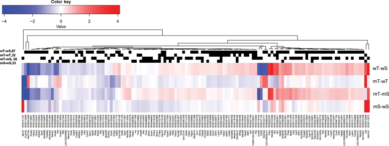
Figure 3.
Heat map presentation of four two-group comparisons of significantly changed mitochondrial proteins (from MITOP2). Blue represents decreased abundance and red represents increased abundance (in log2-fold change). The black strips above the heat maps described proteins that were significantly changed in the corresponding two-group comparison. mT, mCAT-TAC; mS, mCAT-Sham; wT, WT-TAC; wS, WT-sham.

