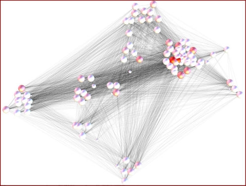
Figure 7.
A network diagram illustrating the connectedness among Indiana EDs that participate in PHESS. Circular nodes represent EDs; node size indicates the visit volume; node color indicates the centrality of the ED. The gray edges connecting nodes indicate where patient crossover occurs. EDs that share proportionally larger number of patients are clustered together. While general clusters of “medical trading areas” emerge, the myriad gray edges clearly illustrate how interconnected all EDs are to one another.

