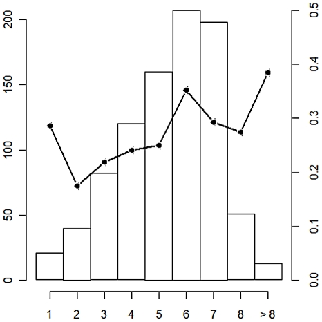
Figure 2. Number of sample animals and IgG seroprevalence rate according to age.
The number of sampled animals is given by the histogram, and the black line represents the IgG prevalence rate. Thirteen animals older than 8 were aggregated in the class >8. Age of animals is given by the x axis. The left y axis represents the number of sampled animals for each age class. The right y axis provides the IgG prevalence rate for each age class.

