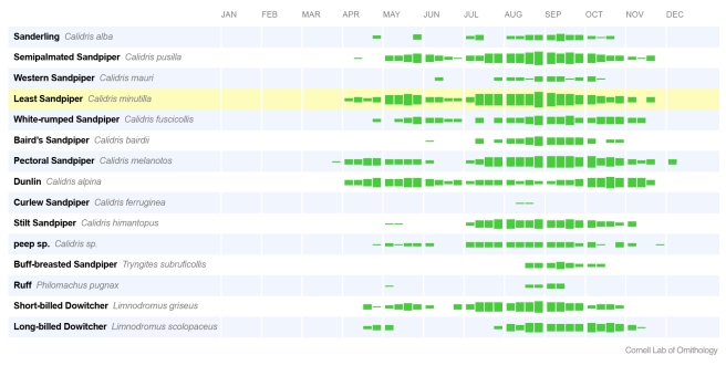
Figure 1. eBird frequency bar chart for Montezuma National Wildlife Refuge.
Data output tools such as the eBird bar charts serve a variety of inter-related purposes from engaging users, to encouraging better data collection, to informing land management decisions. These bar charts for Montezuma National Wildlife Refuge (http://ebird.org/ebird/GuideMe?step=saveChoices&getLocations=ibas&parentState=US-NY&bMonth=01&bYear=1900&eMonth=12&eYear=2011&reportType=location&ibas=US-NY_MOWC&continue.x=34&continue.y=13&continue=Continue) help birders plan trips to see shorebirds, and encourage birders to enter complete checklists of all species to ensure their data are used in output like this. They also provide refuge managers with details on the seasonal occurrence of shorebirds to inform management actions, such as raising or lowering water levels to create feeding habitat for birds. Much of the simple output in eBird uses “frequency of detection”, i.e., the percentage of checklists that report a species. By clicking on the name of any species, like Stilt Sandpiper (http://ebird.org/ebird/GuideMe?cmd=decisionPage&speciesCodes=stisan&getLocations=states&states=US-NY&bYear=1900&eYear=2011&bMonth=1&eMonth=12&reportType=species&parentState=US-NY), you can interact with the data to view locations where the species was found, explore high counts, and view birds per hour. Image credit: Cornell Lab of Ornithology.

