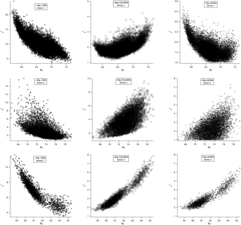
Figure 3.

χ2 versus Rg plots for model SANS curves to SANS data. The top row shows the plots for series 1 model SANS curves compared with measured SANS data from (–Mg–DNA) (left), (+Mg+50ssDNA) (middle), and (+Mg+dsDNA) (right). Series 2 and 3 structures are compared with the same data in the middle and bottom rows, respectively.
