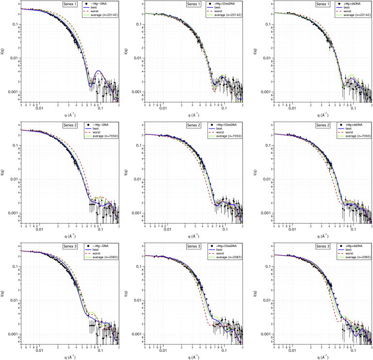
Figure 4.

Best- and worst-fit model SANS curves to SANS data. The top row shows the plots of the measured SANS data for the (–Mg–DNA) (left), (+Mg+50ssDNA) (middle), and (+Mg+dsDNA) (right) samples, along with the best-fitting (lowest χ2) and worst-fitting (highest χ2) model SANS curves from the ensemble of series 1 structures, as well as the average model SANS curve from the entire ensemble of series 1 structures. The number of structures that were used to calculate the average curve is shown in parentheses. Similar model SANS curves for the series 2 and 3 structures are shown along with the measured SANS data in the middle and bottom rows, respectively. Error bars on the measured SANS data represent plus and minus the combined standard uncertainty of the data collection.
