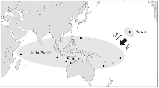
Figure 4. Map depicting migration rates.
Migration rates (Nm: where N is effective female population size and m is migration rate) were calculated using migrate 3.1.6 [61], [62]. Locations were grouped according to the results of structure (Fig. 3, K = 2: Hawai'i and the Indo-Pacific. Arrows indicate direction of migration and the size of each arrow is proportional to migration rate. Numbers above the arrows are the number of migrants per generation estimated with mtDNA.

