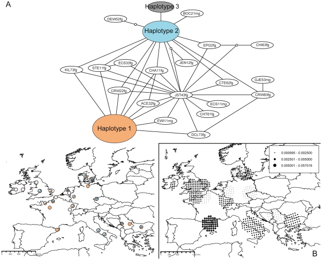
Figure 3. Haplotype network, respective geographic distribution of most-frequent haplotypes (A), and distribution of nucleotide diversities for Psycha grisescens (B).
Colours and portions of pie charts in A) represent main haplotypes and the proportion of samples assigned to each main haplotype at each location, respectively. Dot sizes in B) are proportional to diversity values (see figure caption).

