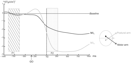
Figure 4.
Power profile in selected band power of the TF energy as a function of time over M1L (black line) and M1R (grey line) averaged across subjects. The arrows indicate the point at which the decrease in the selected band power became significantly different from the baseline (p < 0.05). The rectangular areas indicate the two time windows chosen for the comparison of the mean amplitude (dotted rectangular area F1: from −500 to −300 ms before the GO signal, ns; hatched rectangular area F2: from 0 to +250 ms after T0, p < 0.05).

