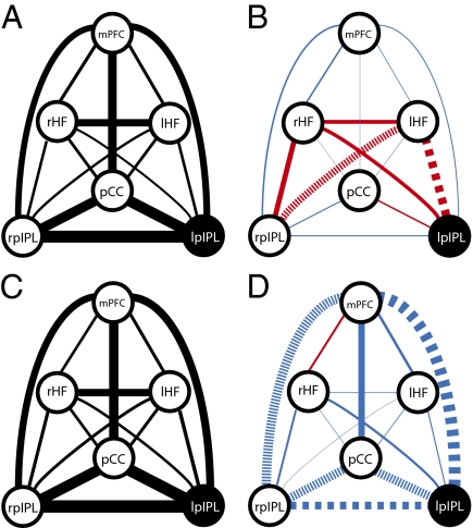
Fig. 4.
Schematic representation of functional connectivity changes across multiple regions within the default network. The thickness of the lines connecting default network regions is proportional to the connectivity strength between these regions. Connectivity is displayed before 1-Hz (A) and 20-Hz (C) rTMS (Left). (Right) Changes in functional connectivity between default network regions as a result of 1-Hz (B) and 20-Hz (D) rTMS. Scaling of line thickness to changes in correlation strength is different between Right and Left. Decreases in functional connectivity are depicted with blue lines, and increases are depicted in red. Large dashed lines signify significant changes (corrected for multiple comparisons). Small dashed lines signify significant correlation changes not surviving multiple comparisons corrections. These results suggest coupling between regions in the default network is dynamic.

