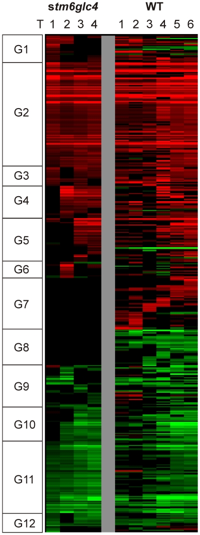
Figure 4. Heat map of all differentially expressed genes which were hierarchically clustered based on stm6glc4 data set.
Changes in transcript abundance compared to T0 are indicated by different colors: Red (increase), Green (decrease) and Black (unchanged). Genes were categorized into 12 different groups (G1–12) based on their expression patterns.

