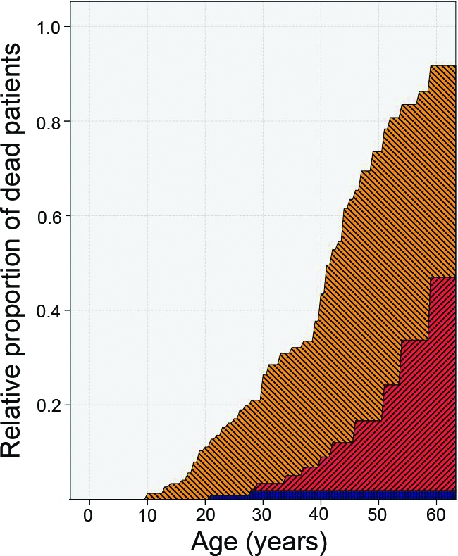
Figure 4.

Survival analysis using a competing risk model. This analysis only aims at describing relative proportions (the composition of the study population) for specific patient ages. It therefore only pretends to give a (an unbiased) graphical description for each possible number of years since birth of how many patients at that moment were actually already dead or alive with enchondroma (EC) or chondrosarcoma (CHS) or alive without detection of EC or CHS. More precisely, at each point in time (patient age), it shows the relative proportion of study patients already dead without EC or CHS (the blue pattern); the proportion already dead after detection of EC or CHS (the red or inclining pattern); the proportion at that age alive with EC or CHS (the yellow or declining pattern); and the proportion alive at that age without EC or CHS. Note that the separation between the two shaded areas (red and orange) is in fact the overall survival duration of this group of patients; the border between the silver and the orange area is the survival interval free from EC and CHS. Again, the interpretation is a description of the age at onset of EC or CHS death among these specific patients; it is useful as a description of the population and gives insight into the interplay of the competing risks (dying versus acquiring EC or CHS). It is not a predictive model per se because this is not a cohort followed from birth but a set of patients defined retrospectively on the basis of the occurrence of disease.
