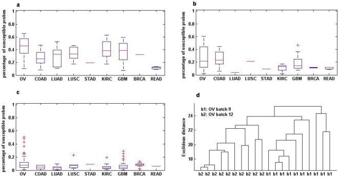
Figure 1. Batch effects on tumour samples for nine cancer types.
(a) different batches and different laboratories; (b) the same laboratory but different batches; (c) the same batch but different laboratories; (d) Hierarchical clustering the tumour samples of ovarian serous cystadenocarcinoma in batch 9 and batch 12. For a cancer type denoted in the x-axis in graph a, b or c, a box plot in the y-axis represents the percentage of probes significantly susceptible to different batch conditions. The percentage takes value ranging from 0 (no susceptible probe) to 1 (100% susceptible probes). Each box stretches from the lower hinge (defined as the 25th percentile) to the upper hinge (the 75th percentile) and the median is shown as a line across the box.

