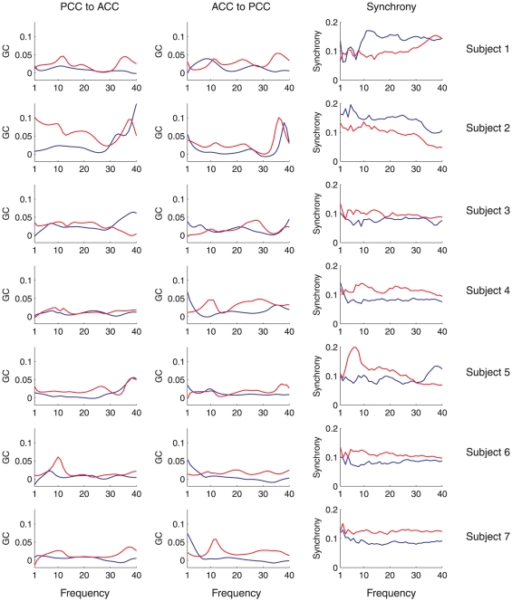
Figure 6. Plots of mean spectral GC and synchrony against frequency.
Left column shows the mean spectral GC in the direction PCC ACC by frequency, for WR (blue) and LOC (red). The middle column shows the same data for mean GC in the direction PCC
 ACC. The right column shows mean phase synchrony by frequency. Each row shows a different subject.

