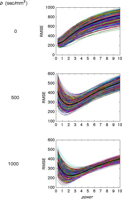
Figure 5.
Simulation results comparing gold standard images and p-mean images for Subject 1. The root mean squared error (RMSE, y-axis) is plotted against the power value (x-axis) for 1000 examples (thin lines) and the mean of the 1000 examples (thick black lines) for b = 0 (top row), 500 (middle row), and 1000 (bottom row) sec/mm2. The power value that produces the minimum RMSE between the gold standard and p-mean images increases with increasing b-value.

