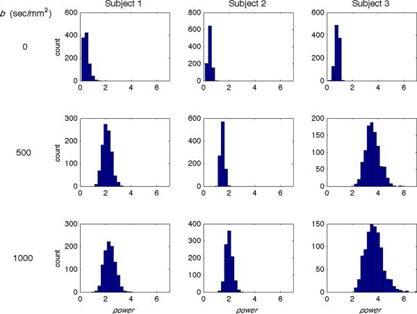
Figure 6.
Simulation results comparing gold standard images and p-mean images for a superior slice of all subjects and b-values. Histograms show power values that produce the lowest RMSEs between the gold standard and p-mean images from 1000 trials for Subject 1 (left column), 2 (middle column), and 3 (right column) and for b = 0 (top row), 500 (middle row), and 1000 (bottom row) sec/mm2. The histogram means increase with increasing b-value for each subject.

