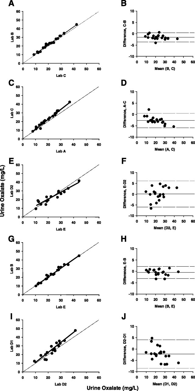
Fig. 4.

(A–J) Between laboratory agreement from Experiment 2. (A, C, E, G, I) Direct comparison between indicated pairs of laboratories is shown with dashed identity line and trend line in solid. (B, D, F, H, J) Bland–Altman plots for the same pairs of laboratories. Solid line represents the mean bias and the dashed lines indicate upper and lower limits of agreement. Panels A and B show pairs of highly correlated laboratories using the oxalate oxidase kit, while Panels C and D compare laboratories with lower correlation coefficients using the same method. Panels E and F show comparison between the two laboratories using HPLC-based methods. Panels G, H and I, J show pairs in which one laboratory uses the oxalate oxidase method, with the other using an HPLC-derived method, and presenting high (Panels G and H) or weak agreement (Panels I and J).
