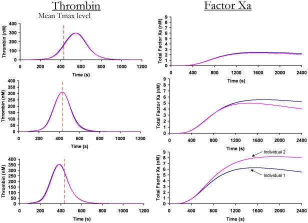
Figure 5. Comparing factor Xa and thrombin generation.
Thrombin generation profiles from the same population, previously determined using the same methodology [15], are compared to their fXa profiles. Three pairs of overlapping individual thrombin generation profiles are shown on the left. The dashed line indicates the mean time to the maximum level of thrombin generation within the healthy population (432 s). The corresponding fXa generation profiles in the same individuals are shown on the right.

