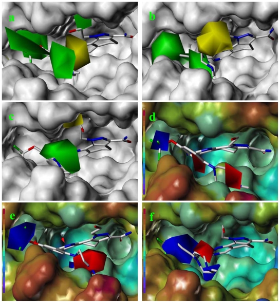
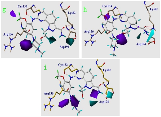
Figure 7.
The CoMSIA contour map combined with compound 73. Steric field distribution for (a) model 4, (b) model 5 and (c) model 6, on the background of protein surface. Electrostatic field distribution for (d) model 4, (e) model 5, and (f) model 6, on the background of electrostatic potential surface colored from purple to red owing to the increase of electron density. Hydrogen bond donor field distribution for (g) model 4, (h) model 5 and (i) model 6. Green contours indicate regions where bulky groups increase activity, whereas yellow contours indicate regions where bulky groups decrease activity. Positive potential favored areas are in blue, and positive potential unfavored areas are in red. Cyan and purple contours indicate favorable and unfavorable hydrogen bond donor group. The hydrogen bond is represented with orange dotted line.


