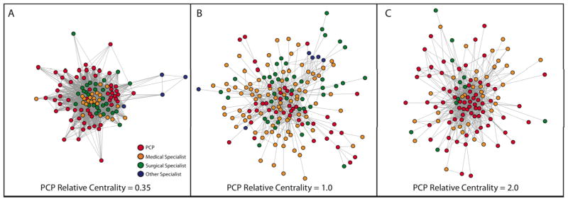
Figure 2. Example Hospital Networks: Illustrating Relative Centrality.
Three example hospital networks from the dataset in this study are depicted in Figures 2A–C. Each point represents a physician, colored by the specialty of that physician (red = primary care, orange = medical specialist, green = surgical specialist [including general surgeons], blue = other specialist). Each tie between two physicians represents the sharing of 5 or more patients. This figure depicts both the complex organization of physicians in different hospitals, but also visually demonstrates how the concept of relative centrality reflects changes in physician networks. In Figure 2A, the PCP relative centrality (explained in Fig. 1C) is 0.35, so PCPs are about a third as central as other physicians in this network. This is reflected by the tight group of medical and surgical specialists at the center of this physician network, with the many PCPs in the network pushed to the periphery of this network. In Fig. 2B and 2C, PCPs move more toward the center of patient-sharing exchanges as the PCP relative centrality grows.

