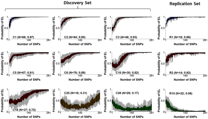
Figure 8. Example of 9 clusters of genetic risk profiles in centenarians of the discovery set and 3 similar clusters in replication sets 1 and 2.
In each plot, the x-axis reports the number of SNPs in each genetic risk model (1,…,281), and the y-axis reports the posterior probability of exceptional longevity predicted by each model. The boxplots (one for each SNP set on the x axis) display the genetic risk profiles of the centenarians grouped in the same cluster. Numbers N in parentheses are the cluster sizes, and the average posterior probability of exceptional longevity. Color coding represents the strength of the genetic risk to predict EL (Blue: P(EL|∑281)>0.95; Red: 0.5<P(EL|∑281)<0.95; Orange: 0.20<P(EL|∑281)<0.5; Green: P(EL|∑281)<0.2). The full set of 26 clusters is in Figure S11 and includes more than 90% of centenarians in the discovery set.

