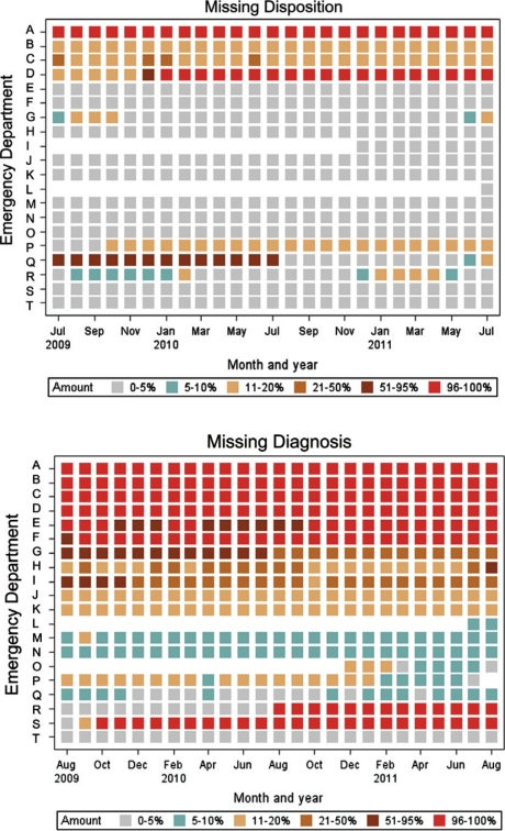
Fig. 1.
Heatmaps showing percent of records at each ED missing patient disposition (top) and diagnosis (bottom) data over time. The heatmaps provide a visual cue for when data quality has changed (color shifts), where data are routinely unavailable (stable color over time) or missing (white space). The heatmaps are generated monthly for each of 13 data quality measures.

