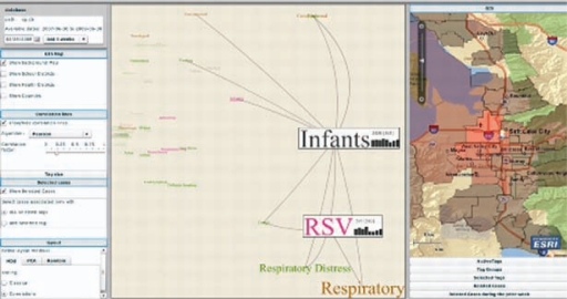
Fig. 1.
Screen shot of the EpiCanvas Infectious Disease Weather Map interface showing various components of the system. Left panel: date and time interval selection, Configuration options for GIS Map, Correlation Lines, Tag size, Selected cases, and Layout methods. Center panel: a tag cloud with “Infant” and “RSV” tags selected. Right panel: GIS map with choropleth map symbolized based on incidence (more red=higher incidence) and showing ZIP codes where both “Infant” and “RSV” tags are active. Not shown are list of active tags, Tag Groups, Selected tags, Related Cases line list and Related Cases time series graph depicting the counts of selected tags (both individual and shared) over time.

