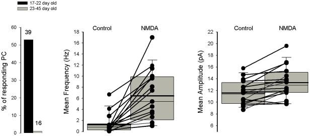
Figure 4. Summary of NMDA effects on mEPSCs recorded in Purkinje cells recorded from slice cultures.
Graph on the left represents % Purkinje cells in which an NMDA-mediated increase in mEPSC frequency is observed as a function of Purkinje cell age. Graphs in middle and on the right represent respectively the mEPSC mean frequency and mean amplitude before and after the first application NMDA recorded in Purkinje cells from 12–22 day old slice cultures. A representation with box plots indicating the mean values (thick line) and median values (thin line) has been adopted because of the non-normal distribution of mean frequency and mean amplitude values. The bottom and the top of the box represent the 25th and 75 th percentile respectively. The ends of the whiskers represent the 5th/95th percentile.

