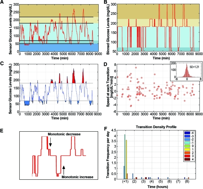
FIG. 1.
Transition density profile: a cumulative measure of severity and frequency of glycemic change. (A) Raw continuous glucose monitoring data from a diabetes patient with mean glucose equal to 121.9 mg/dL. Colored horizontal bands indicate different user-defined glucose ranges. (B) Raw continuous glucose monitoring data are categorized into bins according to user-defined threshold ranges, defined here as (0, 50, 70, 180, 220, 300 mg/dL). The percentage of time spent in each bin is displayed in red. (C) Area under the curve above and below the hyper-/hypoglycemic limit of 180 (red) and 70 (blue) mg/dL, respectively. The area under the curve is a measure of hyper- and hypoglycemic severity in conjunction with the (D) transition speed, or the rate of change in glucose at the transition between each threshold. (Thresholds are defined as 0, 50, 70, 120, 180, 220, and 300 mg/dL.) (Inset) Histogram of the slopes over each 5-min time interval. (E) Example of binned continuous glucose monitoring data where a monotonic increase and decrease was observed. The duration of these monotonic increases/decreases was then calculated for the (F) transition density profile. The number of transitions per day where transitions are described as the magnitude of every continuous monotonic change in blood glucose levels, after smoothing, sorted into the number of thresholds crossed (e.g., 2, 4, −3, −5) and separated into the time interval necessary to complete each change (e.g., <1 h, between 1 and 2 h, 2 and 3 h, etc.). Negative numbers indicate monotonic decreases. Color graphics available online at www.liebertonline.com/dia

