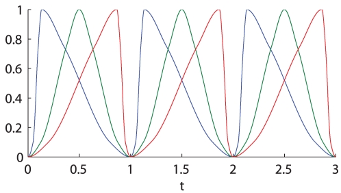
Figure 1. Constuction of the input signal  with different shapes.
The plot shows the  signal skewed to left (blue), the symmetric one (green) and the one skewed to right (red), with a period of 1 h. The shape of the signals have been chosen so that all of the three signals are above the value 0.1 for 75% of the time and above the value 0.75 for 25% of the time. The shape of the blue curve has been obtained interpolating the points (0,0) (0.05, 0.1) (0.1,0.75) (0.1333,1.0000) (0.35,0.75) (0.8, 0.1) (1, 0); the green curve interpolating the points (0,0) (0.125,0.1) (0.375, 0.75) (0.5,1) (0.625, 0.75) (0.875, 0.1) (1, 0); the red curve interpolating the points (0, 0) (0.2, 0.1) (0.65, 0.75) (0.8667, 1) (0.9, 0.75) (0.95, 0.1) (1,0).

