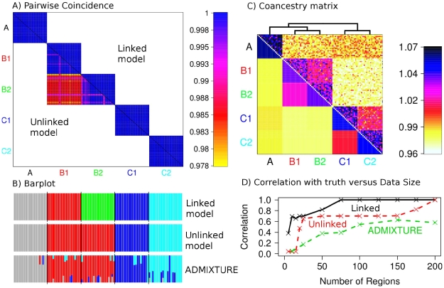
Figure 3. Simulated data population assignment results.
A) Pairwise coincidence matrix output by fineSTRUCTURE using chunk counts calculated using (top right) the linked and (bottom left) unlinked model, for the datasets from Figure 2C. The colouring represents the posterior coincidence probability (which does not drop below 97%) and the dots represent the maximum a posteriori (MAP) probability state. B) STRUCTURE-style ‘barplot’ for the results in A as well as ADMIXTURE results for the same dataset, where each colour represents a population ( ,
,  and
and  respectively). C) Aggregated coancestry matrix (bottom left, normalized to have row mean 1) for the linked model dataset (top right) rescaled from Figure 2C (also top right), shown with the inferred MAP tree (top). D) Correlation with the truth as a function of the number of 5 Mb data regions for fineSTRUCTURE linked and unlinked models, and ADMIXTURE on the same data.

