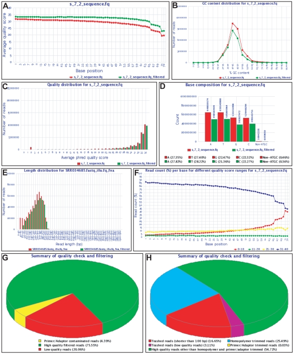
Figure 3. Snapshots showing graphs of various QC statistics generated as output by QC tools.
(A) Average quality score for each base position, (B) GC content distribution, (C) Average Phred quality score distribution, (D) Base composition and (E) read length distribution for both input (red) and HQ filtered (green) data. (F) Percentage of reads with different quality score ranges at each base position. (G,H) Pie charts show summary of QC analysis of Illumina (G) and Roche 454 (H) data.

