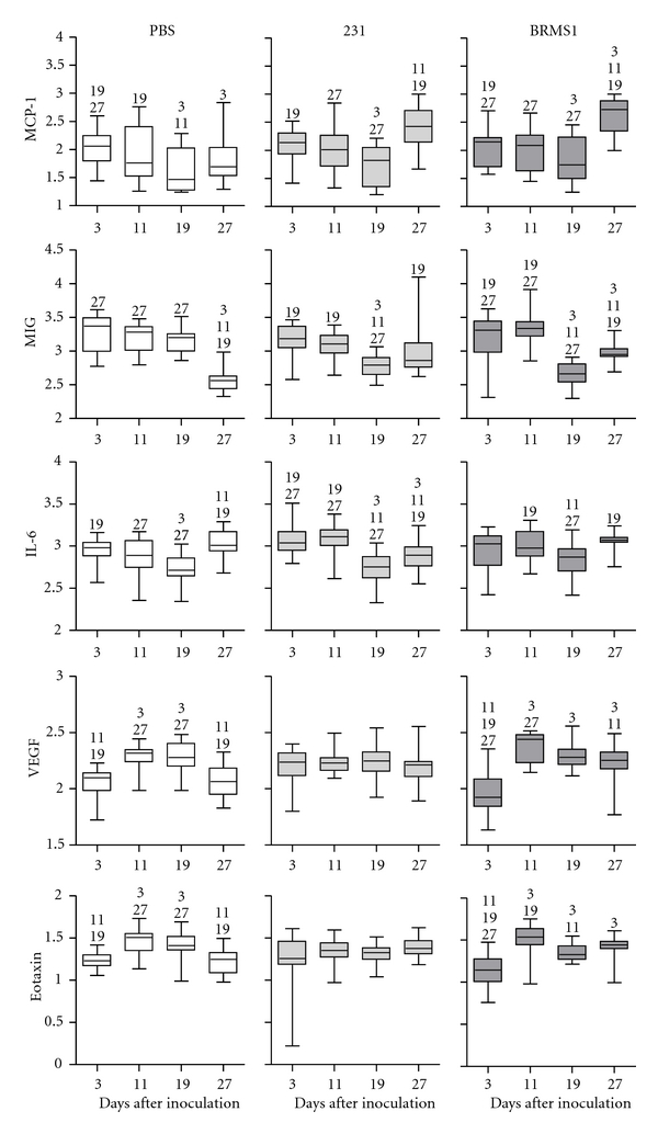
Figure 4.

Changes in bone cytokine levels over time. Cytokine values were obtained as described in Section 2. Results were log10 transformed for analysis and graphic comparison of each injection group over the 4 points of the study. Each box plot graph represents the change in a particular cytokine level for one injection group over time. The box represents the 75–25% range of values; the horizontal line within the box denotes the mean. Bars above and below the box mark the maximum and minimum values. Numbers above each box denote a significant difference (P < 0.05) between time points. n = 8.
