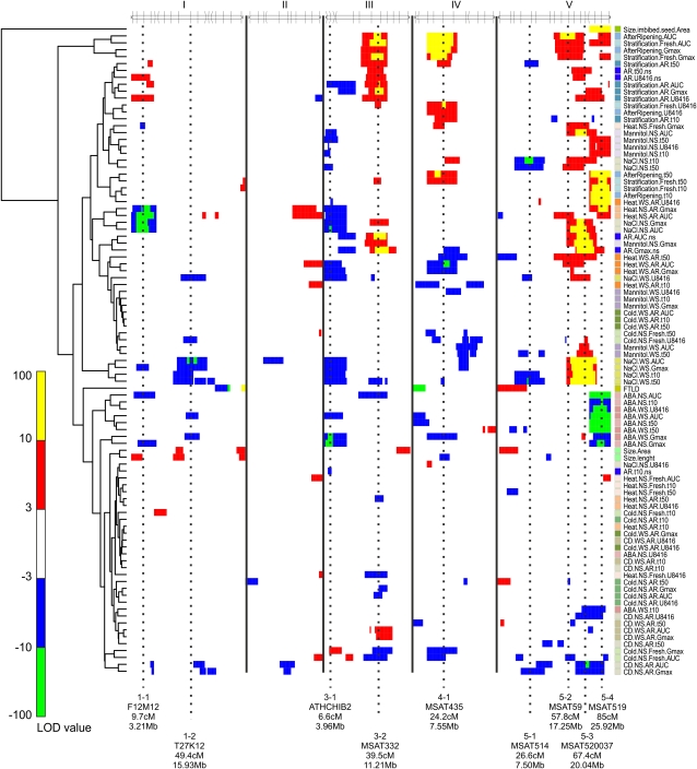
Figure 3.
A clustered heat map showing the LOD profiles of the measured traits. Columns indicate chromosome position along the five chromosomes; rows indicate individual-trait LOD profiles. A false-color scale is used to indicate the QTL significance. Positive values (yellow and red) represent a larger effect of the treatment in Sha, and negative values (blue and green) represent a larger effect of the treatment in Bay-0. Dashed lines indicate major QTL positions, which are further discussed in Table IV. Clustering on the left shows correlation between QTL profiles.

