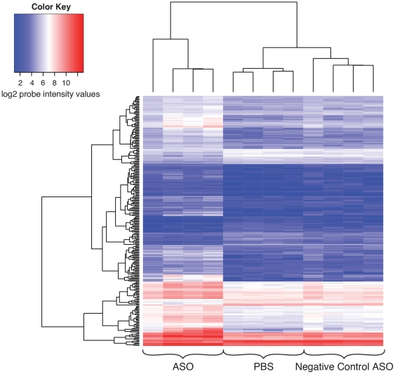
Figure 5. Heatmap of the log2 normalized intensities of the significantly differentially expressed 260 gene probes on the array.
The columns represent the PBS, ASO treated, and negative control samples and the rows represent the 260 differentially expressed gene probes on the array. The heatmap shows that the majority of the differentially expressed genes show mostly upregulation after ASO treatment. This is shown by the transition of probe intensities to higher values relative to the PBS and negative control samples for the 260 gene probes. The dendrogram on the left of the heatmap shows the clustering of genes having similar profiles across samples. The dendrogram on top of the heatmap shows the clustering of the samples. The PBS and negative control samples clustered together whereas the ASO treated samples clustered separately.

