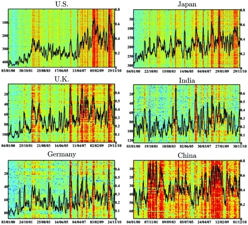
Figure 3. Dynamics of the intra-correlation.
For each market, we use a 22-day window, and in each window calculate the intra-correlation. This results in the dynamics of the intra-correlation for the period of 2000–2010, for each market separately. Each horizontal line represents the average correlation of one stock (the left y-axis displays the number of the stock). The western markets and Japan show a similar behavior, visualized through vertical stripes at the same time, showing synchronized waves of strong correlations. The black line shows the average of all correlations at a given 22-day window (corresponding to the right y-axis). The trend is increasing for all countries except for China.

