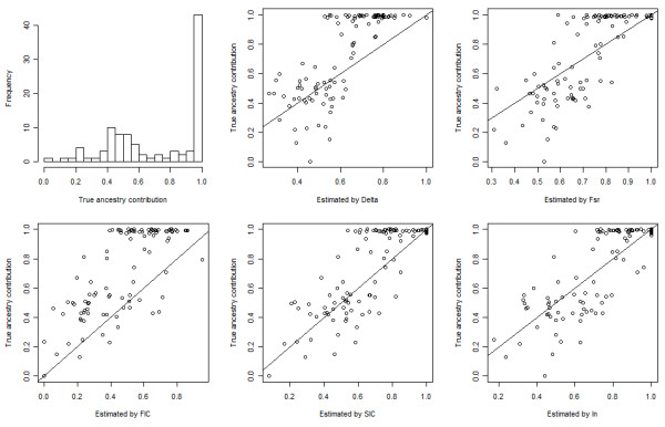
Figure 8.

Individual true ancestry contributions and estimated contributions using top 50 AIMs of the simulated admixed population from CHB and JPT. Top-left panel: histogram of individual true ancestry contributions. Top-middle panel to bottom-right panel: scatter plot of individual true ancestry contributions vs. individual estimated contributions using top 50 AIMs selected by Delta, FST, FIC, SIC, and In, respectively.
