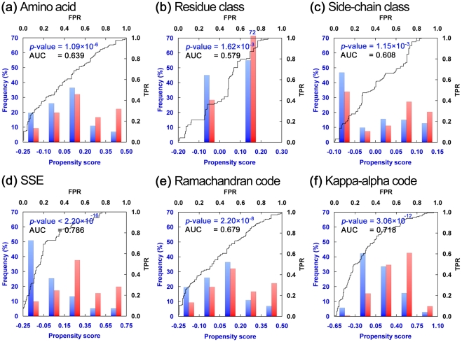
Figure 2. Distributions and ROC Curves of Propensity Scores.
Here, a propensity score was calculated as the relative propensity of a pattern between the background and viable CP sites weighted by 1 – p-value (see Formula 1). A high relative propensity and a small p-value resulted in a high score. A zero score means that there was no obvious difference between the frequencies of the pattern in the background and viable CP sites, or the difference was statistically insignificant. These plots show distributions of several propensity scores for the viable (red bars) and inviable (blue bars) CP sites of Dataset L and their ROC curves. Plots (a)–(c) and (d)–(f) respectively exhibit the results of sequence-based and secondary structure-based propensity scores. The distributions of the sequence-based propensity scores are not very different between the viable and inviable CP sites, and their AUCs are only ∼0.6. The distributions of secondary structure-based propensity scores were rather different between viable and inviable CP sites, and thus the AUCs were higher than those of sequence-based scores. The lower x axis in each plot indicates the propensity score. The left y axis indicates the frequency, i.e., the proportion of residues falling into each score group. The upper x axis and right y axis represent the false positive rate and true positive rate, respectively, for the ROC curve.

