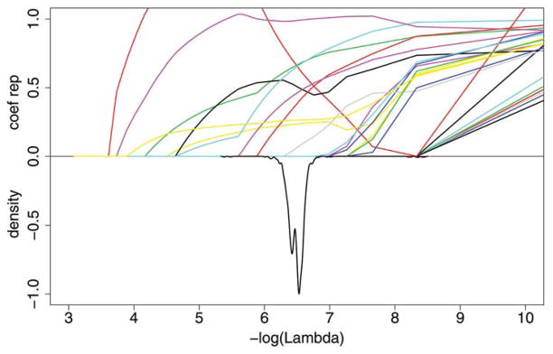
Figure 1.
Plot for Lasso for the SNP data. Each colored line on the top half of the graph represents a different coefficient and shows the magnitude of that coefficient, relative to the ordinary logistic regression estimate, when the smoothing parameter λ varies. The smaller lambda, that is, the larger −log(λ), allows more variables to be included in the model. The bottom half of the graph shows the negative of the normalized density function to demonstrate the range of λ that were selected in the 1000 cross-validation runs. The online version of this figure is in color

