Figure 13.
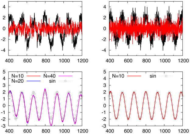
Signals in the top left and top right panels are all known to have sinusoidal trend, but with different levels of autocorrelation and noise. In the top left panel, black curve shows the original signal with relatively large correlation and noise (and thus is more challenging to denoise and to find trend), and the red curve is the first IFD mode. In the bottom left panel, the corresponding sinusoidal trend is labeled with black circles connected by dashed line. In the same time, we also choose different stopping criteria used for the IFD to study and compare the convergence and stability. The values of N = 10, 20 and 40 indicate the number of iterations used before stopping. In the panel, all three curves were very close to each other, which indicates good numerical stability and convergence of the IFD. In the top right panel, signal with sinusoidal trend but smaller correlation is plotted with black curve. Red line is the first IFD mode. In the bottom right panel, only one IFD with N = 10 is plotted, since the convergence between IFD trend and exact sinusoidal trend is almost perfect.

