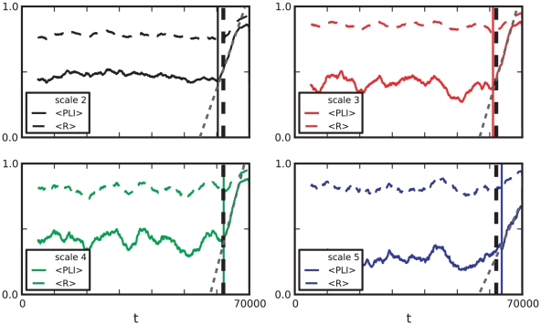
Figure 8. Comparison between  and mean phase coherence
  for patient 1.
Both measures based on phase-synchronization show a similar behavior with an increase around seizure onset time. Colored vertical lines indicate the beginning of the increase in synchronization near seizure onset (black dashed vertical line). The increase appears to be linear (grey dotted lines) and starts at different times for different scales.

