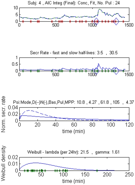
Figure 1. Part of the graphic output of the deconvolution analysis in a male control subject, the upper panel shows the original serum PRL concentrations (µg/L) and the fitted concentration curve (interrupted line).
Asterisks denote pulse onsets, and the rhomboids the time of waveform switch. Time 0 min is 0900 hr. The second panel shows the secretion rate in µg/L.min. The third panel represents the secretion rate within bursts (normalized secretion over time) for the daytime (interrupted line) and nighttime (continuous line), stressing the difference in time at which the maximal secretion rate is reached. The lowest plot shows the statistical distribution of the interpulse delays.

