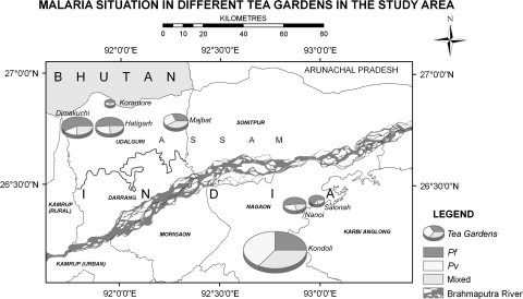
Fig. 1.
Study areas showing malaria situation. The pie charts indicate the location of the study tea estates named along with the each chart. The color in the pie chart represents the actual number of P. falciparum, P. vivax and mixed infection reported in the corresponding tea estate. No additional layers of data have been incorporated in the pie charts

