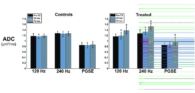
Fig. 4.
Bar graph representing the mean ADC values obtained across all animals, for both treated and control groups. Error bars represent one standard deviation of the mean. The control group shows little variation in ADC across imaging time points, while all three methods show an increase in ADC following treatment, with OGSE methods demonstrating a more pronounced effect. A ‘+’ symbol above data bars represents a statistically significant difference in ADC from pre-treatment values at the p < 0.05 level.

